CHAMPAGNE KRUG
A RENEWED EXPRESSION FOR A TIMELESS CLASSIC
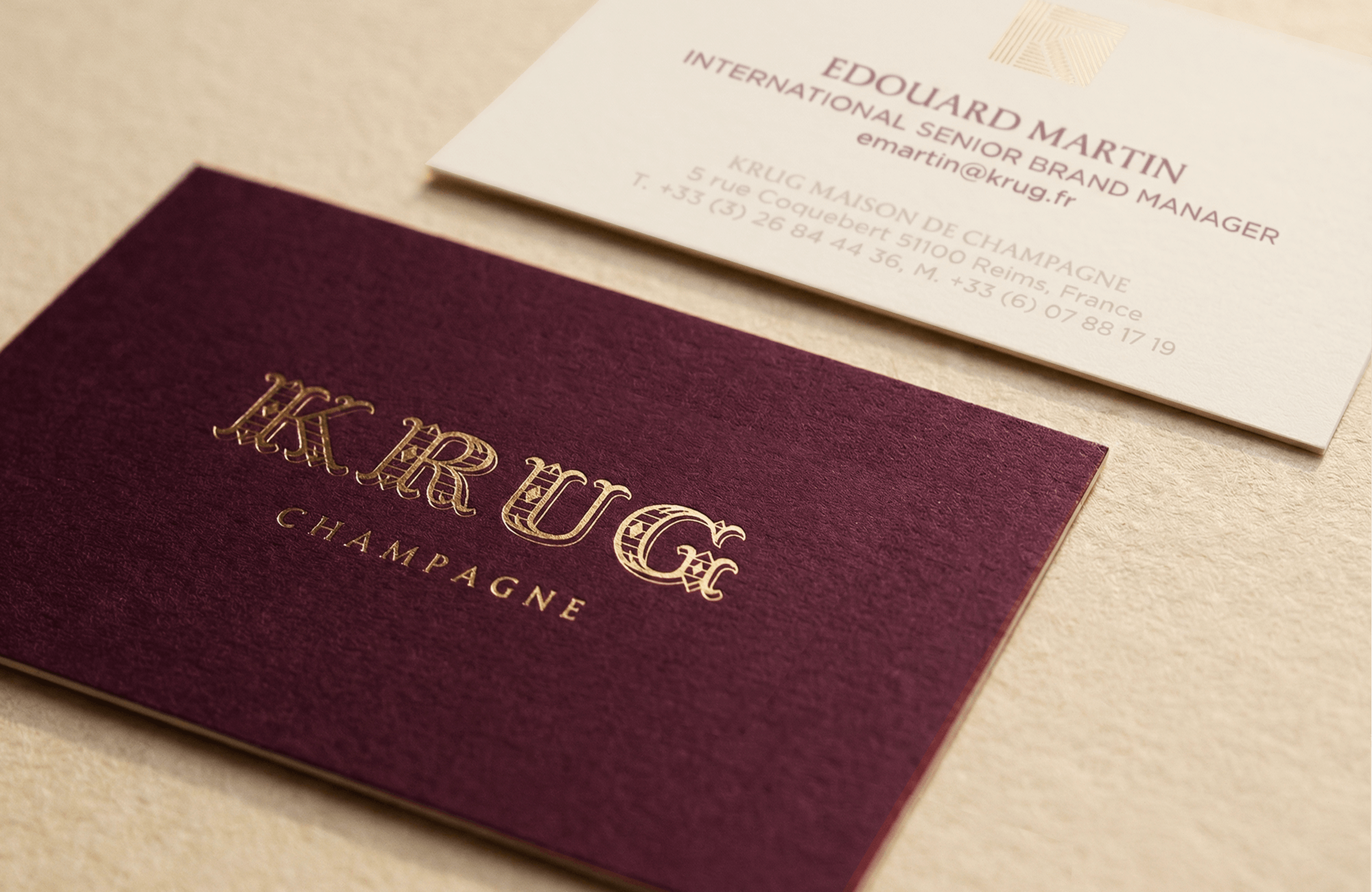
GoodPeopleWander supported Maison Krug in the redesign of its visual identity. Without altering a deeply rooted identity, we reworked the full set of brand codes: secondary logotypes, symbol systems, typography, color palette, and usage rules. The goal: a visually luxurious system, more coherent, and simpler to deploy across all markets.
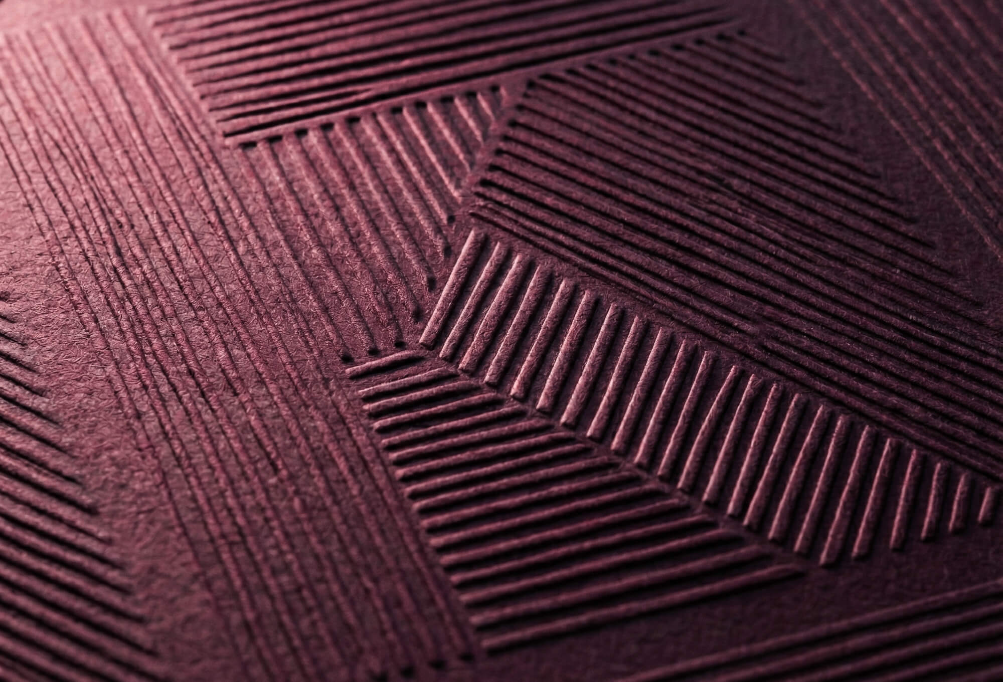
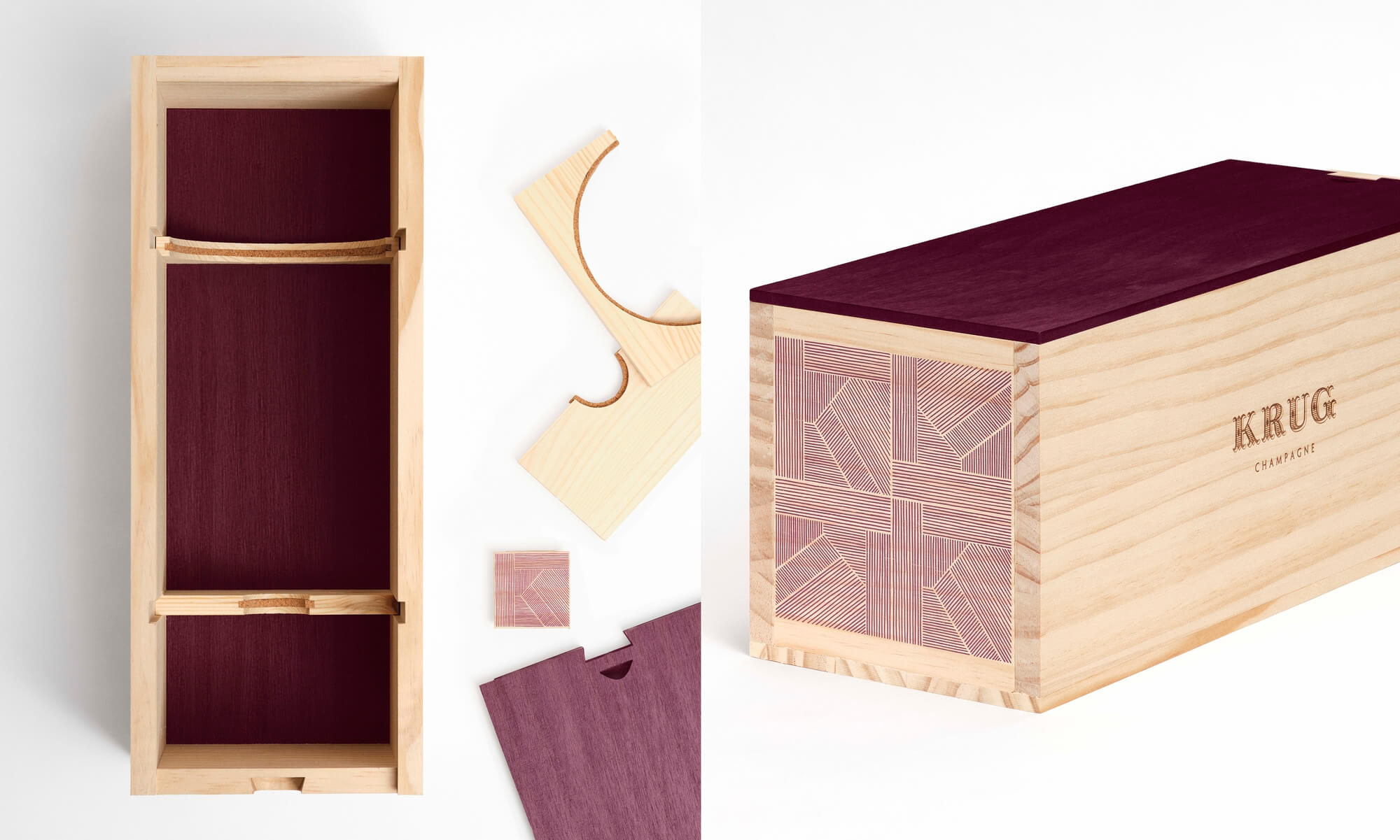
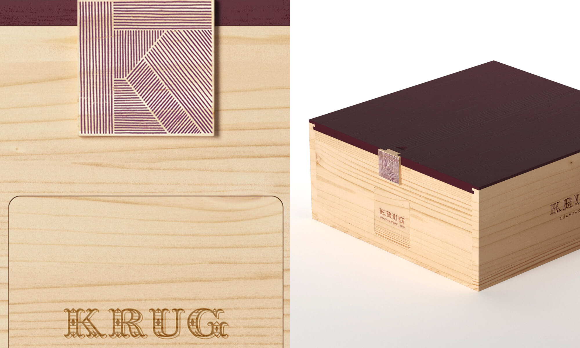
This new framework then served as the foundation to rethink key brand assets: stationery, presentation templates, and most notably, the institutional wooden case, a true signature object of the Maison. Revisiting this iconic case meant striking a delicate balance: honoring the original design while embedding it in a contemporary and responsible luxury vision. Every material and formal choice reflects the principles of the new guidelines: PEFC-certified Spanish Radiata pine, Dark Cherry plant-based stain, 100% bio-sourced varnish, key-lock closure inspired by the iconic K pattern, and labels designed to resist obsolescence.
Together, the refreshed visual identity and the institutional case form a single gesture: reaffirming Krug’s codes with precision, subtlety, and conscience, for a Maison that places accuracy and sustainability at the heart of its expression.
Brand redesign
Graphic design
Typography creation
Visual Guidelines
Powerpoint template
Product Design